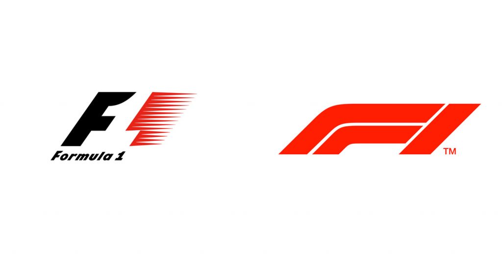
Formula 1 has revealed a new logo for 2018. This is a big change since the iconic F1 logo has been used since 1987. Liberty Media wants to make big changes to F1, trying to retain their fans while attracting new ones.
F1 chairman Chase Carey explained the decision to change the logo was to “emphasize the excitement and fresh energy” Liberty want to bring to the sport.
“What we wanted to do was provide a fresh energy to the sport and I think we have a lot of plans for the future, a lot of things we want to do and we thought the logo was a good way to emphasise the excitement, fresh energy and a new day to take the sport to a new place,” he said.
“That’s respecting what the sport has been. We’re not looking to change the sport, we’re looking to provide a fresh innovation and energy to a great sport that we can enhance in a number of ways.”
Because most people don’t like change and are sentimental, the new logo has received a lot of hate. For me, I love the old logo, but this new one has something special. I know it has some big shoes to fill, but there is something really nice about that F. It is clearly a turn on a race track. It has an extremely modern and high-tech feel to it which is exactly what Formula 1 is! Cutting-edge technology that makes a car go as fast as possible around a corner. For me, this just feels right. And to be honest, if you told me that F1 was redesigning their logo I would have said “WHY?! The current logo is great and doesn’t need an update.” But after seeing this new logo and understanding Liberty Media’s vision to make F1 more exciting for their fans, I say bravo. Bring on the 2018 season!
Here is the reveal video